Star plots are useful in that they observe the behavior of all variables in a test. A star plot is set up with equal angular points, each of which represents a variable. The data is represented by different colored lines that disperse toward the point of the star that the data most heavily favors. The star map below is a graphical analysis of a literary test taken by a student.
http://assessment.tki.org.nz/var/tki-assess/storage/images/media/images/star-1/7992-1-eng-NZ/star-1_main_news.png
Correlation Matrix
The Correlation Matrix show correlation among two or more variables. Correlation refers to any statistical relationship between any given variables. In many statistical methods correlation matrices are relied upon for initial data. Strength of correlation is represented by decimals where as the closer to 1 the variable the stronger the positive relationship and the closer to -1 the stronger the negative relationship. Number close to zero represent a weak correlation. The correlation between two variables is represented by using different shades of color to represent correlation as seen in the diagram below.
http://journalofvision.org/4/4/9/figa10.gif
Similarity Matrix
Similarity matrices are used to place scores on similarities between two variables. The variables are set on a grid with one on the x axis and the other on the y axis. A legend with rankings of similarity is used to place scores in the box in which the two variables meet on the grid based on how similar the two variables are. The scores can be marked by anything from shades of colors to symbols. The diagram below is just an example of how a similarity matrix would look if the mapper used shades of colors to represent scores such as the lighter colors represent a higher score and the darker colors represent a smaller score
http://iv.slis.indiana.edu/sw/images/simvis-large.jpg
Stem and Leaf Plot
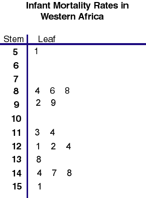
Stem and leaf plots organize numerical data and is broken into two parts the stem and the leaf. The stem usually consists of values of 10 while the leafs will always be units of 1. Like a histogram, stem and leaf plots are useful when trying to visualize the distribution of a set of data. The stem and leaf plot below shows infant mortality rates for western africa.
http://mainland.cctt.org/mathsummer/JosephBond/StemAndPlots/images/table2.gif
Boxplot
Boxplots are good tools for recognizing outliers in a set of data. The box is set up to provide a five number summary which includes the mean, median, quartiles, and any outlier that may exist. Boxplots are advantageous in that one can graph two sets of data on the same graph in order to compare them. The diagram below is just to show the viewer how a boxplot is set up on an axis either horizontally or vertically.
http://www.math.sfu.ca/~cschwarz/Stat-301/Handouts/boxplot.png
Histogram
Histograms are useful visual graphs in looking at frequencies of given events. A histogram is set up as such where the groups of data being measured is separated into classes along the x-axis while the frequency amounts are lined up on the y axis. A histogram is extremely useful in providing a graphical summary to the shape of the distribution of the data. The graph below shows the length of time in weeks to receive a contraceptive and the frequency of the observed times.
http://cs.anu.edu.au/escience/lecture/cg/CGIntroduction/Data/histogram.gif
Parallel Coordinate Graph
Parallel coordinate graphs are used to display multivariate data in order to look for common trends in different variables. Each variable is assigned a different color and the data is plotted numerous time. Outliers are seen in the lines that stand alone while trends amongst the variables are seen in the large clusters of lines. The map below was used by a cancer research institute to find similarities in cancer patients.
http://gis.cancer.gov/images/nci/estat_pcp2.jpg
Triangular Plot
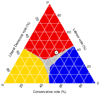
Triangular plots are used to compare three separate variables in order to find similarities and differences in the data. The triangular plot is unique in that the three variable take up a certain portion of the triangle based on their weight. The plot below shows three different voting percentages of particular parties with a grey neutral area and what appears to be mean center for the data marked by the white dot.
http://www.ex-parrot.com/~chris/images/20050407/triangle.png
Windrose
A windrose is a tool used by meteorologist to show wind speed and direction at a location over a given period of time. The windrose is fundamentally based off of the compass rose in order to give a precise reading on the wind direction. Meteorologist use these for tracking wind currents and can also be helpful in the prediction of tornados. The wind rose below uses lighter colors to represent light winds and darker colors to represent heavy wind in its location.
http://www.maine.gov/dep/air/meteorology/windroses/Images/owlshead%202002%20to%202006%20windrose.gif
Climograph
Climographs are visual graph that help to show meteorologists the precipitation amount and temperature for a specific region over a given period of time. These charts can be useful for meteorologists in identifying climatic change and in weather prediction based on a statistical model. The climograph below is very complex in that it not only shows temperature and precipitation but the lunar cycle as well.
http://www.sci.uidaho.edu/scripter/geog100/lect/06-climates/low-lat-climates/7-12-climograph-tropical-wet-dry.jpg
Population Profile
Population profiles generally come in the form of a beehive chart and can compare populations according to age,sex, and some kind of variable. In addition population profiles are almost always developed on a survey basis. The population profile as seen in the map below is very useful in that one gets a side by side visual comparison of population, sex, and aids cases.
http://www.fao.org/docrep/005/y8331e/y8331e02.jpg
Scatterplot
Scatter plots are graphs used to show correlation between two different variables. The variables are plotted on a x and y axis based on their x and y value. These maps are useful in visualizing common tendecies between two separate variables. The map below compares the mean temperature to the elevation of a certain region and they show a strong negative correlation.
http://staff.argyll.epsb.ca/jreed/math9/strand4/scatterplot1.gif
Index Value Plot
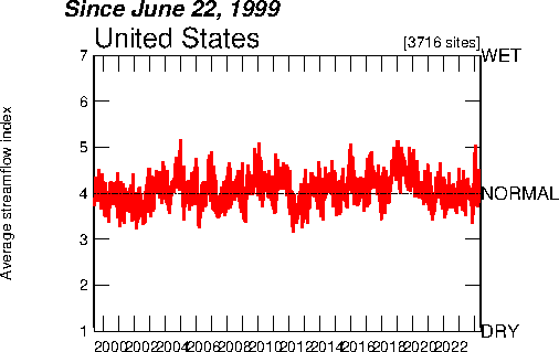
Index value plot is a form of visualtion that compares data values against the norm. The line in the middle represents normal tendencies of the variable while the red lines represent index values of the data in comparison to the normal outcome. The plot below shows the normal streamline index in black and the red represents the actual outcome for the years 1999-2009
http://waterwatch.usgs.gov/regplots/real/real_us_2.gif
Lorenz Curve
A lorenz curve compares the cumulative value of data to a perfect equality line. The data in the lorenz curve is plotted based on distribution percentages then is measured against the perfect equality line where each x and y data is equal. The map below show the cumulative income percentage as well as cummulative population percentage and compares it to the an perfect equality line that represents if the entire population has the same income.
http://content.answers.com/main/content/img/oxford/Oxford_Geography/0198606737.lorenz-curve.1.jpg
Bilateral Graph
Bilateral graphs are a hybrid of a histograms that are used to display multiple variables on a single graph. The goal is generally to use three standard bars to represent positive data on one side and negative data on the other side with comparing it to a middle bar that is the zero line. The map below represents the approval ratings of leadership in the china, with the positive data being the approval, the negative data being the negative data, and the dont know being the zero line.
http://media.gallup.com/poll/graphs/080429China2Graph2_GASJIDHUQfredo.gif
Nominal Area Choropleth Map
Nominal area choropleth maps reprsent nominal data without any particular ranking. With nominal data it is important for the mapper to choose a color scheme with equal density since the goal is not to distinguish between data values but just to be able to distinguish between classes. Below is a map of safe drinking water for a particular region the data is not ranked it is only showing differences in classes.
http://geoportal.icimod.org/UserFiles/Image/capacity%20building/elearning/Figure%208_3b.jpg
Standardize Choropleth Map
Standardizing data is essential for statistical comparison. Choropleth Maps that are standardized represent data for a variable by separating into classes then ranking them based on density. A common technique to representing different data values in standardized maps is to use similar symbols or colors to represent different levels of density in the data. The map shown below uses different shades of color to standardize the data and rank the data.
http://upload.wikimedia.org/wikipedia/en/0/09/England-subdivisions-Muslim-population-2001.png
Unstandardized Choropleth Map
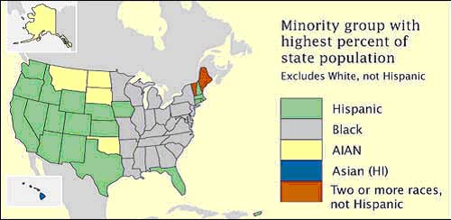
Standardizing data in Choropleth maps is a method used for comparing the distribution of a variable. Choropleth maps that are unstandardized are represented by a scale that separates different classes but are not ranked and are distinguished from eachother by either symbols or colors. The map below compares the different classes which happens to be the largest minority percentage per state. While the larger percentages are represented in the map the classes in the map are no ranked.
https://courseware.e-education.psu.edu/courses/geog482/graphics/citationexample.jpg
Bivariate Chloropleth Map
Unlike a univariate map a bivariate map displays two variable and uses two table to represent data. These maps can use symbols or colors to represent different data values for a variable. The map below uses both as it uses small circles each filled to a certain density to represent voter turn out by age while the color represent the margin of victory for the two candidates.
http://wpcontent.answers.com/wikipedia/commons/thumb/c/ca/2004US_election_map.svg/280px-2004US_election_map.svg.png
Univariate Chloropleth Map
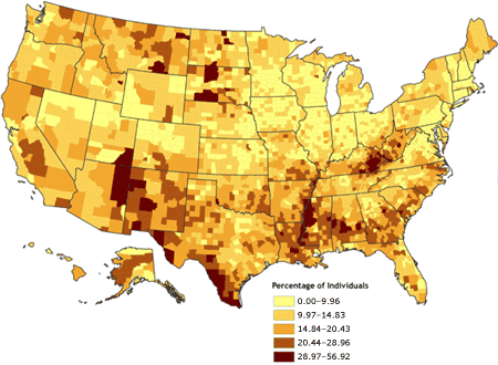
An univariate chloropleth map displays a single variable while using a single symbol or color to represent data. These maps can be used to represent a number of variable from rainfall amounts to population of a given area. Like all chloropleth maps different colors are utilized to represent different amounts of data. The map below uses darker shades of brown to represent higher percentages of people in an area while lighter shades of represent smaller percentages of people.
http://www.cdc.gov/pcd/issues/2007/oct/images/07_0091_01.gif
Unclassed Chlorpleth Map
An unclassed chloropleth map is similar to a classed chloropleth in that it uses shades of color to represent different amounts of data values. Where as a chloropleth map uses multiple classes to organize data an unclassed chloropleth map has one class and uses different hues of similar colors to represent data. As depicted in the map below there is one class and larger data is represent by a shade of brown that turns into blue to represent lesser data.
http://www.esds.ac.uk/international/images/gis2005.gif
Classed Choropleth Maps
A classed chloropleth map uses colors to discriminate between the data of a selected class. A mapper will decide on how many classes he or she wants to represent based on a number of things such as quantiles and display those classes using different shades of a color to represent the intesnity of the data. Generally greater amounts of data are represented using bolder shades of a color while smaller values are represented by lighter shades. The map below shows the number of deaths per 1,000 live births for Australia.
http://www.eps.mq.edu.au/courses/GEOS219/images/deaths.jpg
Range Graded Proportional Circle Map
Range Graded Proportional Circle Maps use shaded circles to represent a numerical range of the data being measured. The data being measured is separated into groups based breaks or quantiles and the cartographer will use a number of methods such as shading or circle size to represent different ranges. The map below uses both techniques to show the Indian population of the western United States.
http://www.neiu.edu/~smkope/387/BasicPage/Proportional%20Circle%20Map.jpg
Continuously Variable Proportional Circle Map
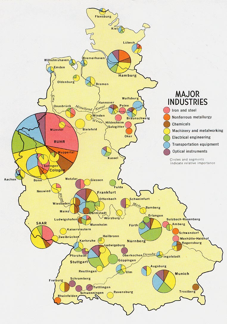
A Continuously Variable Proportional Circle Map uses circles that are proportion to the data being measured to represent continuous data. These maps are very useful in displaying information that can not be counted which can be a very difficult task. As seen in the map below the circles are scaled to represent the continuous data proportionately.
http://www.lib.utexas.edu/maps/europe/west_germany_ind_1972.jpg
DOQQ Map
A DOQQ map or Digital Orthophoto Quarter-Quadrangles map uses a computer generated aerial photo and uses the geometric features of a map. They are created by using a camera that is sensitive to terrain displacement to create the image. I chose the map below because it demonstrates the sensitivity of the camera as it captures even the sand shelf that lies underwater directly off the beach.
http://www.whitestar.com/images/products/doqq_tx_310.jpg
DEM map
DEM maps or digital elevation models use remote sensing along with a rasterization of colors to display changes in elevation over a topographic terrain. In addition these DEMs can be made by land surveying. These maps are useful in deciphering land and water movement as well as the developing of physical models.
http://rst.gsfc.nasa.gov/Sect11/originals/Fig11_14.jpg
DLG Map
DLG maps or Digital Line maps use digitally applied vectors to display cartographic information. Most of these maps use aerial photos of topographic features then use digital line enhancements to better display geographical features. These maps are useful in land surveying among many others. The map below displays Athens, Georgia by using the vectors one can clearly distinguish between the man-made and the geographical elements of Athens.
http://ga.water.usgs.gov/olympics/athens.dlg.gif
DRG
DRG maps or digitally rastered graphic maps you a combination of topographic maps and reproduces them in a digital form. The digital form is produced by using a resolution of 500 green, blue, and red dots per square inch. These maps are useful in the collection of digital data. I selected the map below because it was the most vivid in detail giving the best example of the capabilities of DRG maps.
http://egsc.usgs.gov/isb/pubs/factsheets/fs08801.graphics/drg.jpg
Isohyets
Isohyets are contour lines that show equal amounts of rainfall. These maps are not only useful in the field of meteorology but are also very helpful in agriculture. Using the statistical method based on these maps farmers can better understand when the appropriate times to grow their crops. Also these maps help provide insight on how rain effects fluvial systems. I chose the map below because it shows the drastic change in rainfall amounts.
http://www.watres.com/projects/pj0124-temburong_transfer_scheme-03.jpg
Isopleth
Isopleth maps take on two different meanings, depending on what they are being applied towards. In cartography, Isopleth lines represents equal data that must be calculated and not measured. In meteorology, Isopleths can be any kind of contour line. In the map below the geographical term is being demonstrated as a laboratory has to calculate hydrogen ion concentration as PH.
http://2.bp.blogspot.com/_f9wcd3zZdq0/STlvaYI5AbI/AAAAAAAAANM/PPqm6BqPWQw/s320/isopleth.gif
Isopach
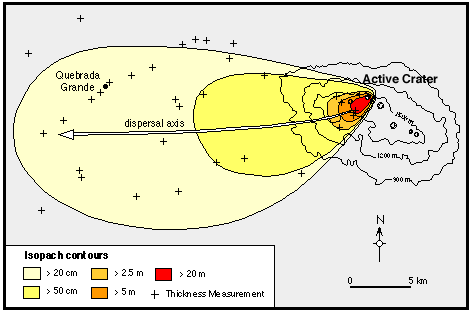
Isopach maps use contour lines to demonstrate differences in thickness of a certain entity. This mainly pertains to geologist to measure different thicknesses in surface rock. Being able to understand the thickness of a surface is important in land surveying and for finding oil as well as other natural resources in the Earth. As demonstrated in this map below Isopach can also be used for measuring earth deposit in the air and can be useful in the field of volcanology.
http://www.geo.utexas.edu/faculty/barker/kempter/rbtephra.gif
Isotach
Isotachs are lines of equal wind speed on a map. Isotachs are most important to meteorology as a lot of weather phenomena is dependent on the wind. In addition wind speed is important to air travel as air traffic controllers try to get the wind behind the air craft in effort to save on time and fuel. The map below shows isotachs at a particular time for the continental united states.
https://blogger.googleusercontent.com/img/b/R29vZ2xl/AVvXsEgRzfC2gGsSmF72S9joJclDgOm7zpWwwE3ue5E0XivcogGKwBxPhSeEp-JS6TY8u-156Q7QIr6JAqNKIKjvvuNo55Ez5LujLPk7x2P6c3quKa-roPo2Zmw1NYmc0v-TPDdpvMLdwMBC4NuC/s400/isotach.gif
LIDAR
LIDAR or Light Detection And Ranging, uses scattered light to measure the topographic properties of a surface. A receiver is fixed onto an aircraft, usually an airplane, and it sends out a rapid laser beam and uses the data to show elevation. This has also been used by satellites to measure elevation on the moon and other cosmic entities. LIDAR a very useful tool in developing topographic map. I chose the photo below because it depicts the changes in elevation in very vivid colors.
http://www.rotorworksllc.com/images/lidar%20vertical%201.jpg
Isobars
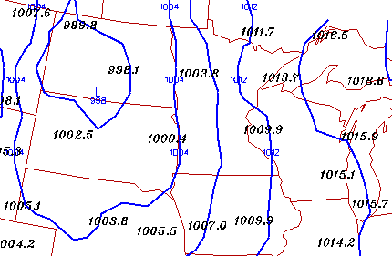
Isobars measure lines of equal barometric pressure on a map. Barometric pressure is a measure of air density against a surface on Earth. This is important in fields such as meteorology as this effects air temperature and is important in understanding climate. The isobar map below shows the barometric pressure in the Great Lakes area of the United States.
http://ww2010.atmos.uiuc.edu/guides/maps/sfcobs/cntr/gifs/bars1.gif
Infrared Aerial Photo
Like Black and white aerial photos, Infrared Aerial photos provide many of the same benefits but provide color photos. The aircraft will send out electromagnetic waves that will show the Earth in its natural color. This is useful as it can show areas of high pollution, deforestation, and vegetation. In fact vegetation will come back in different colors depending on the health of the plant. I chose the picture below because it shows many different contrasts in colors between natural and man-made entities.
http://www.onlakepartners.org/gif/p1101d.gif
Doppler Radar
Doppler Radar is a tool that is used in meteorology to pick up weather phenomena such as thunderstorms, frontal system, hurricanes, and precipitation. It does this by sending out microwaves, once the waves return the computer listens for sound differences in the waves to make a reading. The Doppler Radar has become a very useful tool in areas of meteorology, military, and air travel. The screen shot below shows Hurricane Katrina as it makes landfall in Louisiana.
http://www.micrometgroup.com/images/300px-Hurricane_Katrina_Doppler.gif
Black and White Aerial Photo
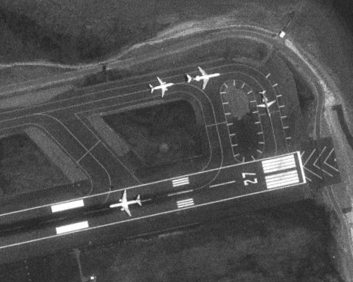
Black and white aerial photos are photos that are taken from airplanes, helicopters, and even satellites that are used to give a better vantage point of an area. With an aerial photo the human eye gets a broader sense of the surroundings. The black and white uses different hues and shades to define certain objects that may be of interest. Aerial photography has as many practical uses as it does military. The photograph below shows an active run way in black and white.
http://www.expertgps.com/images/aerial-photo-boston.jpg
Statistical Map
Statistical maps provide the viewer with change of a set of data over a time. Quantity changes in areas such as population, income, and causes of death can all be mapped statistically. These maps are very useful to forecasters and conservationalist who use the statistical method to make future predictions. The map included show the changes in micropolitan and metropolitan areas in the United States.
http://www.census.gov/popest/gallery/maps/map_20002005.jpg
Cartographic Animation
Cartographic Animation uses animation to depict changes in cartographic information over time. These animations can show many changes in a particular region including, economic, social, political, and cultural. These maps are important for statistical referencing. The animation below shows the increase in divorce rates between 1980 and 1990.
http://www.pop.psu.edu/images/gia/maps/changeanim.gif
Flow Map
Flow maps are used to show the movement of one object from one place to another. These maps can be used to depict the movement of freight, the movement of air traffic, and the migration of peoples. The lines are used to create an image of more movement compared to less movement. The map below shows the amount of telecommunication that takes place between European Nations.
http://www.mundi.net/maps/maps_014/august2000_small.gif
Proportional Circle Map
Proportional circle maps use scaled circles to represent a proportion of data that is being measured. The larger circles represent larger densities in data while smaller circle represent lesser densities. When making these maps it is important to make an accurate scale that clearly depicts differences in densities. The map below show the population of counties in Georgia for the year 2000.
https://blogger.googleusercontent.com/img/b/R29vZ2xl/AVvXsEj2z1KZFguODWc2QFdr_dVpsAjKSXvWyEuEoPs0E6i-qWsraBaVcNrIwm1SlwYgejom8U9xRnpWhemVqbwLl6L26ln6LsmUJ_m-JSJH5Ymxd3rmL156AoQNGmbDWB2AmIeJUjItYNS3AQs/s400/Proportional+Circle.jpg
Isoline Map
Isoline Maps use lines to represent an equal value in a number of things, particularly in the field of meteorology. These maps can use lines to represent equal areas of temperature, wind speed, and barometric pressure. They also have topographic relevance in that they can use contour lines to represent elevation. The map below shows the dewpoint temperatures of the Unites States for a particular day.
http://electoral-vote.com/evp2007/Pres/Carto/Jan01-c.png
Cartogram
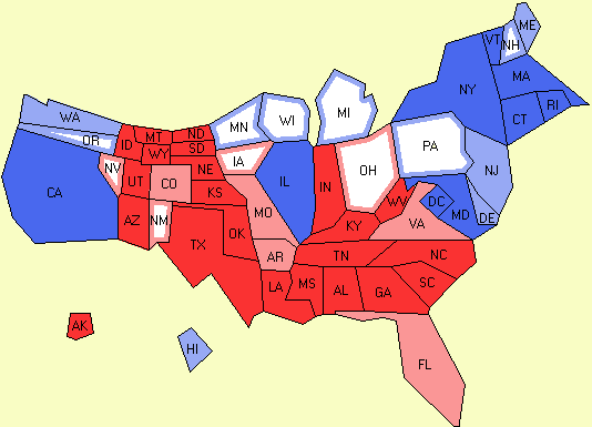
A cartogram is a form of thematic map that instead of depicting an area based on geography it will base an area on some kind of event. These maps separate areas based on things such as economic and social events. They have a very important place in politics for candidates to campaign in major party areas. The map below show the electoral college in the United States
http://electoral-vote.com/evp2007/Pres/Carto/Jan01-c.png
Dot Distribution Maps
Dot Distributions uses plots on a map to represent certain populations. These maps can be used in showing population numbers, ethnicities that reside in an area, and depict many other population characteristics. They can also use different sized dots to represent different densities of a population group. The Map below shows the housing densities in Florida for the year 2000.
https://blogger.googleusercontent.com/img/b/R29vZ2xl/AVvXsEhE96YRCRcYMRJFur9xCL5do6h4q4KiKYHaLO-3l5x0YwH3M3OrSpS3Bn4YCzqgNs2_fa2CFexHl81ylBbjDHIkOTxle6T66oPdt7XPmsRztKOD9kwdYJ7lVSV9_ZmzgMR_VtuxDb6B-h0/s400/Floridadot1.jpg
Hypsometric Maps
Hypsometric maps depict topographic elevation using contour lines and shades of color to show changes in height. These maps become very useful when surveying land for construction purposes. They also have a very important place in environmental studies in that they can depict rises in ocean levels as well as erosion. I selected the map below because it depicts islands, and provides a view of the ocean as well as the continental shelves beneath them.
http://www.reliefshading.com/colors/pictures/hypsometric_AegeanSea.jpg
Propaganda Maps
A propaganda map is used by individuals to influence an individual or group of people thoughts to that of the authors. Propaganda takes many forms and can be used in many ways more notably in politics. Some famous map projections, such as Mercator, would emphasize a certain country to make it seem more powerful and influential. The map below is a sketch of what one individual thought how Ronald Reagan saw the rest of the world.
https://blogger.googleusercontent.com/img/b/R29vZ2xl/AVvXsEiShHgwhwawa_e40Zcolo19vIBpHQB2uS1P9XzpohS9kqzPyvkpo7bamtiI-G0IDjYAdkr3Z67ttRmYQTCXlhkum3HHwRf8Dxt4cEGA_-Gk4T50nAudWvixtxmuTwgOFpOUkOuuO8nBhJA/s400/Propaganda+Map.jpg
Chloropleth Maps
Chloropleth maps are a form for thematic maps that uses colors to show data for a particular region. These maps can depict a number of things such population density,particular races in a region, economic income and so on. It is important when making these maps to use colors that resemble eachother to represent areas of greater data and areas of less data. The map I have provided show the populations in certain regions of the world. When viewing this map it is important to take into account its credibility, due to its lack of detail it would not be a good map to base non-generalized info off of.
http://www.bbc.co.uk/scotland/education/bitesize/standard/img/geography/population/g156.gif
Planimetric Map
Planimetric maps are different from alot of maps because they completely ignore any vertical features of the land and solely apply horizontal features. They are very useful in that they do not depict geographical entities and become very useful in land surveying. The map below shows a hospital from the aerial view and could be very useful in that the buildings are very clearly defined in that topographic features are ignored.
http://www.spatialdc.com/projects/images/rexhospitalplan.jpg
Mental Map
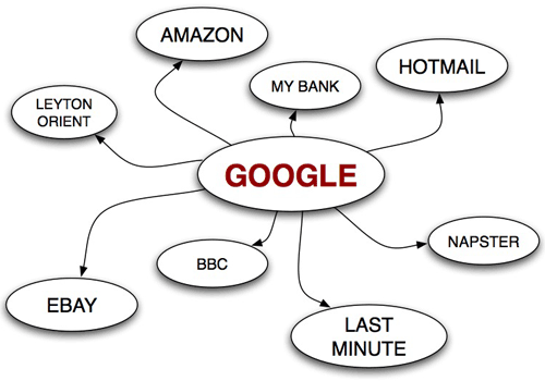
A Mental Map depicts how one sees the world through the eyes of the author, or the person that maps it. Mental maps can show almost infinite amounts of things; from how a person remembers how to get to the grocery store to how one would view a foreign place without even going there. This particular map uses satire to demonstrate how a particular person could view the internet.
http://www.currybet.net/images/articles/2008/euroia2008/mental-map-google.png
Thematic Map
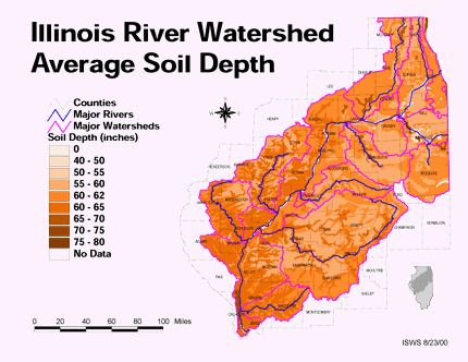
Thematic Maps can portray anything economic to geographic features of a particular area. These maps usually portray one theme and use contrasts in color or boundaries to show the differences. This particular map shows the soil depths in Illinois and uses different shades of a particular color to show the contrasts.
http://ilrdss.isws.illinois.edu/maps/maps_thematic/soildepth.gif
Subscribe to:
Posts (Atom)