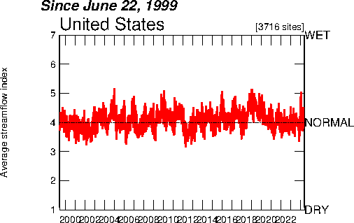
Index value plot is a form of visualtion that compares data values against the norm. The line in the middle represents normal tendencies of the variable while the red lines represent index values of the data in comparison to the normal outcome. The plot below shows the normal streamline index in black and the red represents the actual outcome for the years 1999-2009

http://waterwatch.usgs.gov/regplots/real/real_us_2.gif
No comments:
Post a Comment